ERI Website Redesign
Fall 2023ERI is a non-profit with the goal of supporting individuals with disabilities and providing training and design services to organization. The company site hadn’t been updated for several years and it was time for a fresh, attractive look.
My role in the project was design and front-end development with suggestions on broad strokes of content, this project was supported by content writers and a backend developer supporting more technical functions.
The mockups were done in Illustrator and website developed in WordPress with Cornerstone. This was my second site developed at the company and first attempt at developing templates.
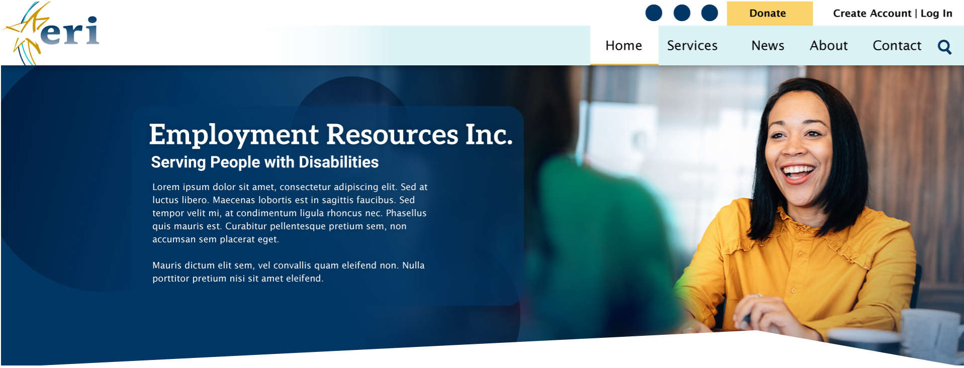
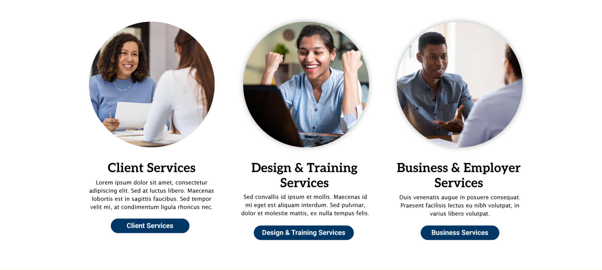
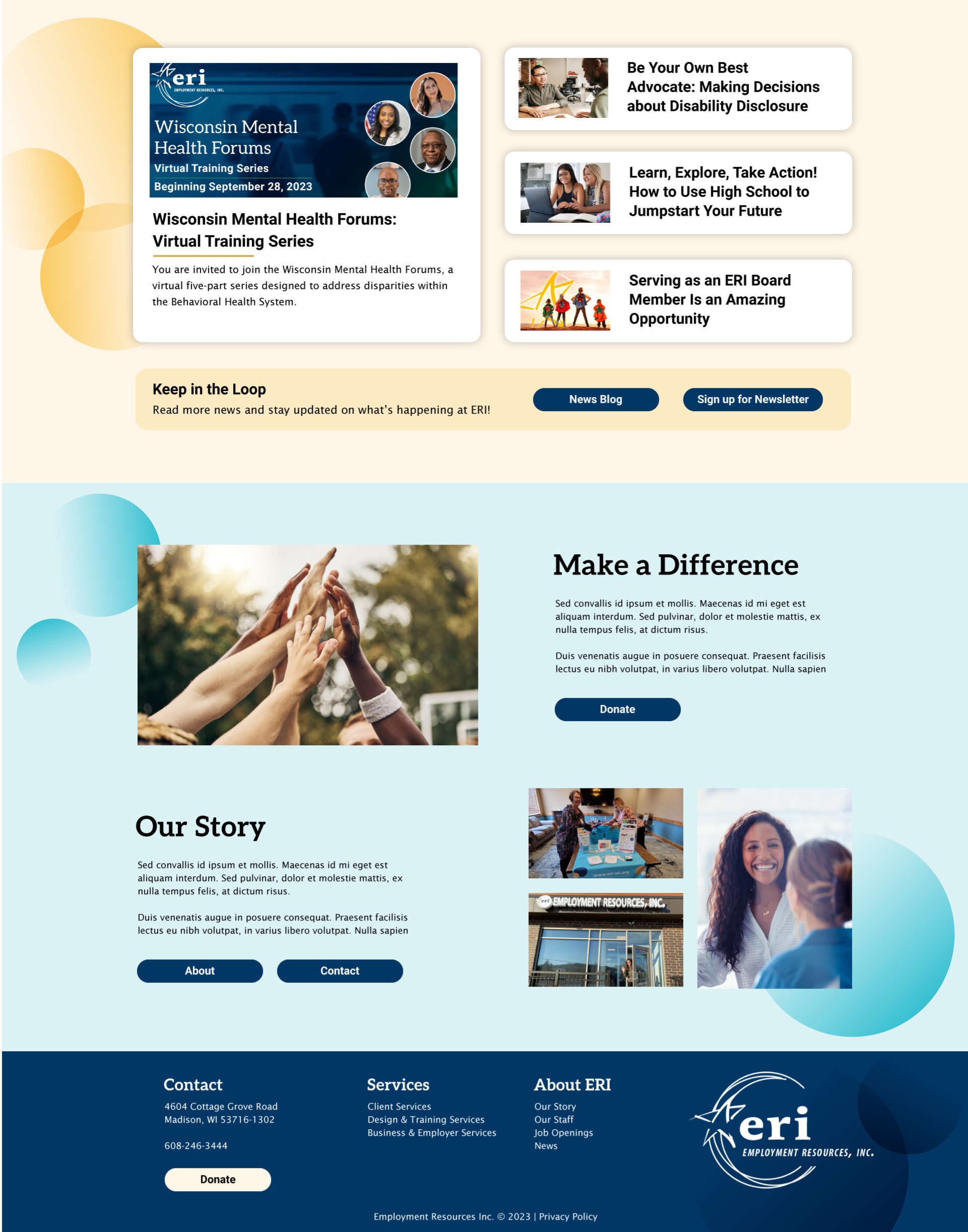
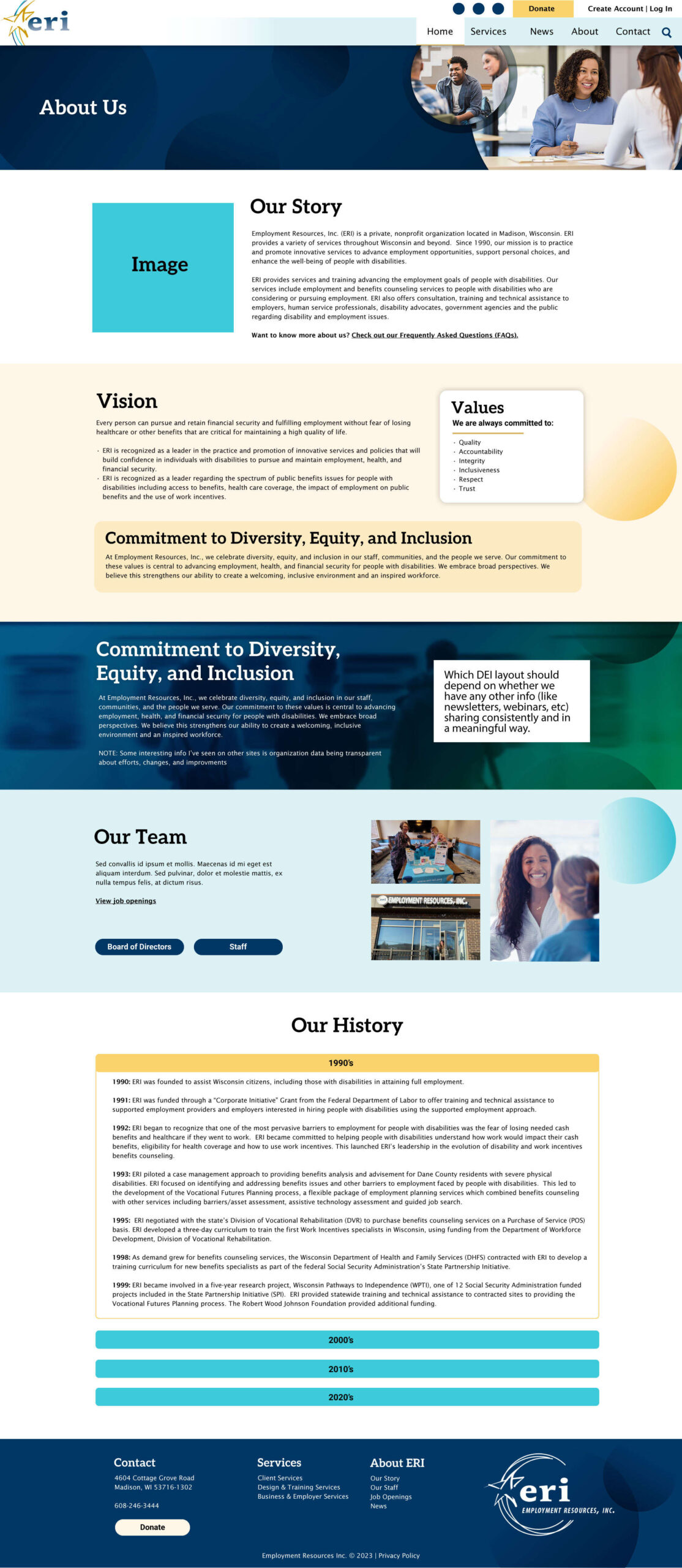
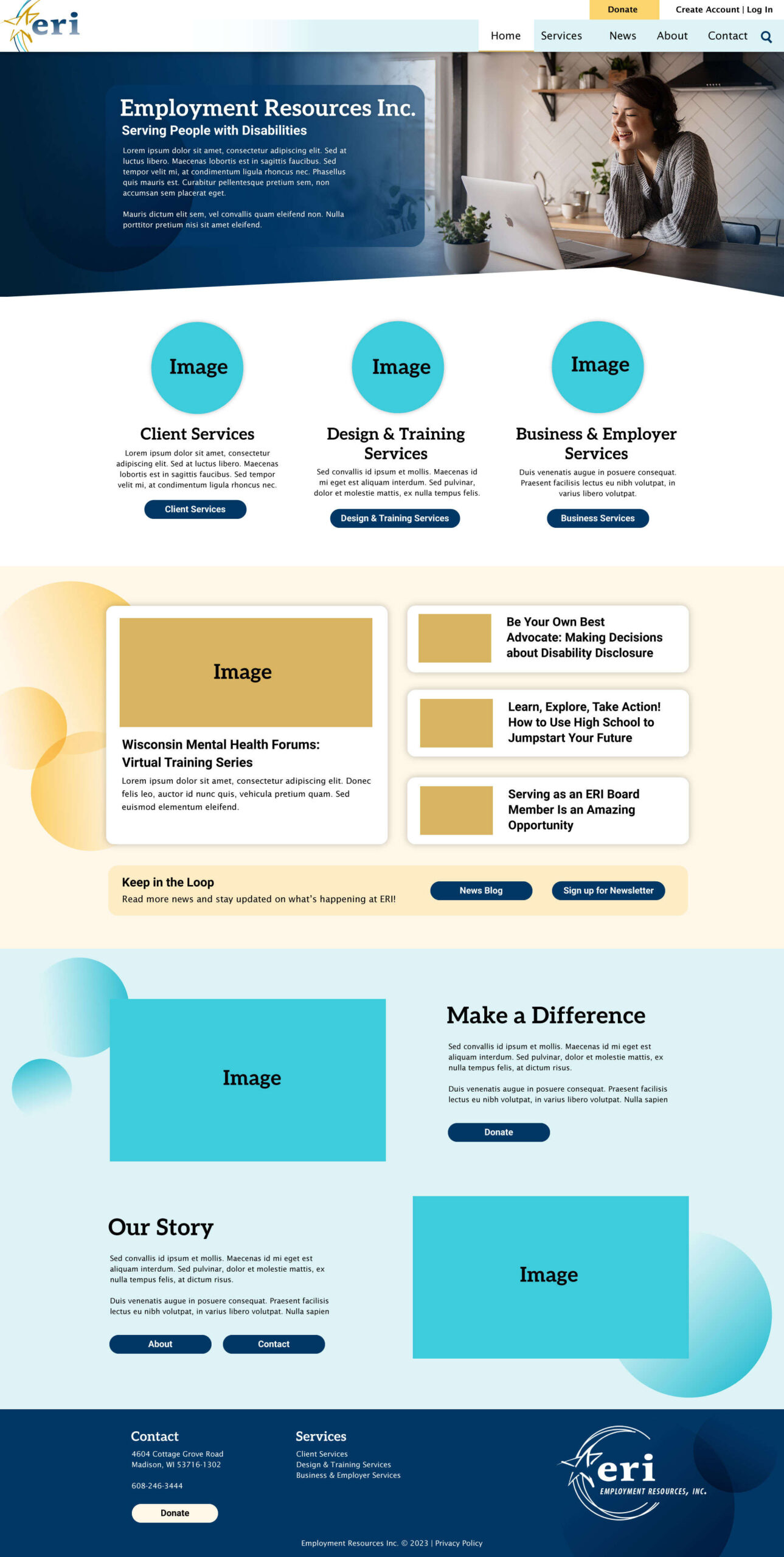
Final Mockup
After a multitude of discussion, revisions, multiple font changes, the new ERI site finished being developed in WordPress using the Cornerstone page builder.
The templates I built for this site were my first attempt while still learning how our page builder worked. While they were good enough for me to train team members on how to use and kept things fairly consistent across the site there was still room for improvement.
I proposed developing a Template Site, where I had free reign to experiment and continue improving templates, incorporate variables, and other methods of keeping sites clean and consistent.
My Process
Where do we begin?
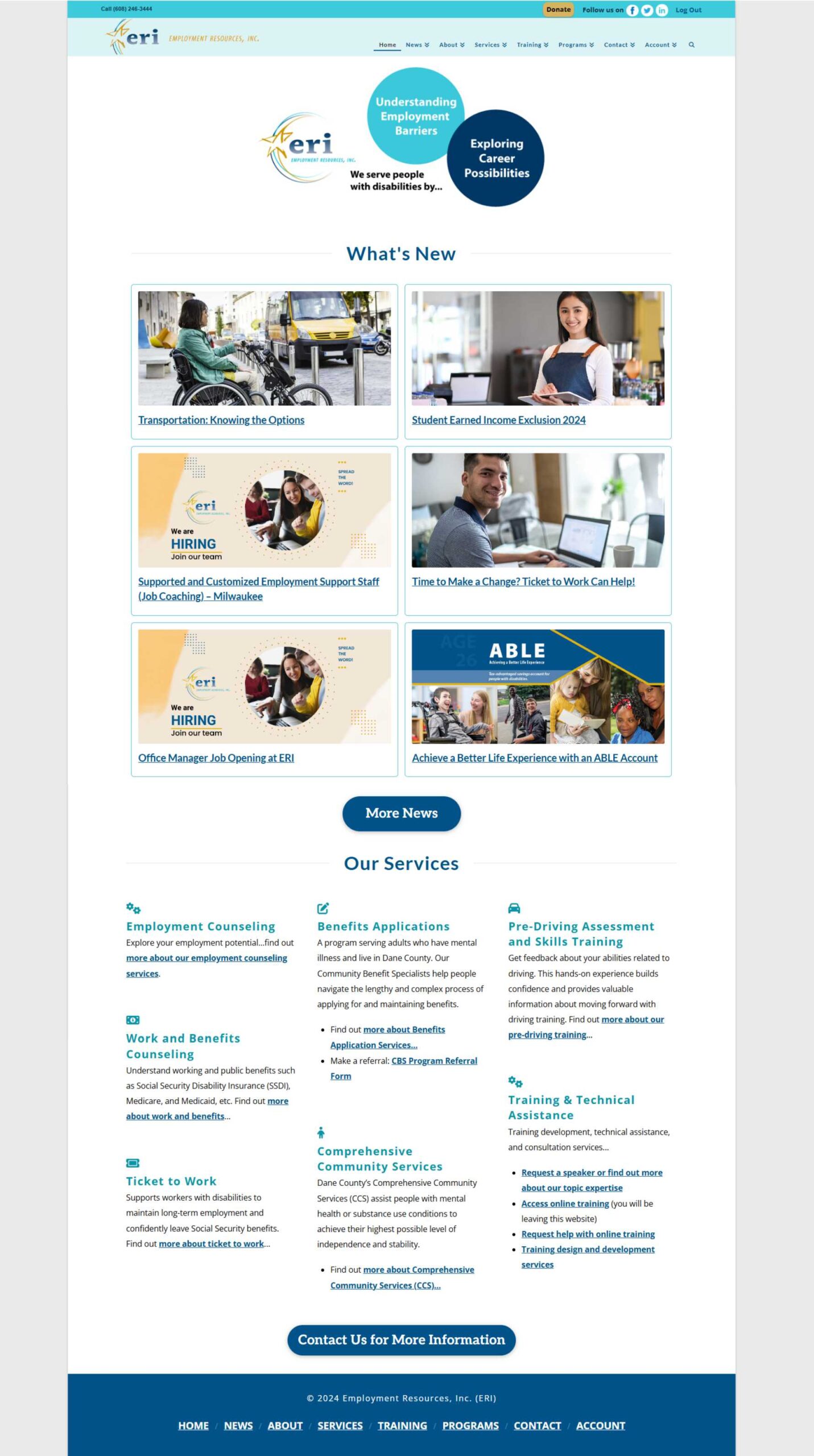
With a quick look at the original site we can immediately notice some areas for improvement:
- Moving away from the contained look,
- Revisiting our services and marketing priorities,
- and increasing contrast for accessibility (and style!)
We weren’t just serving the community anymore. Our internal design team had transformed into an agency, servicing universities and projects on a national scale (Wisconsin, Kansas, and Washington D.C. to name a few)
Now was the opportunity to highlight it.
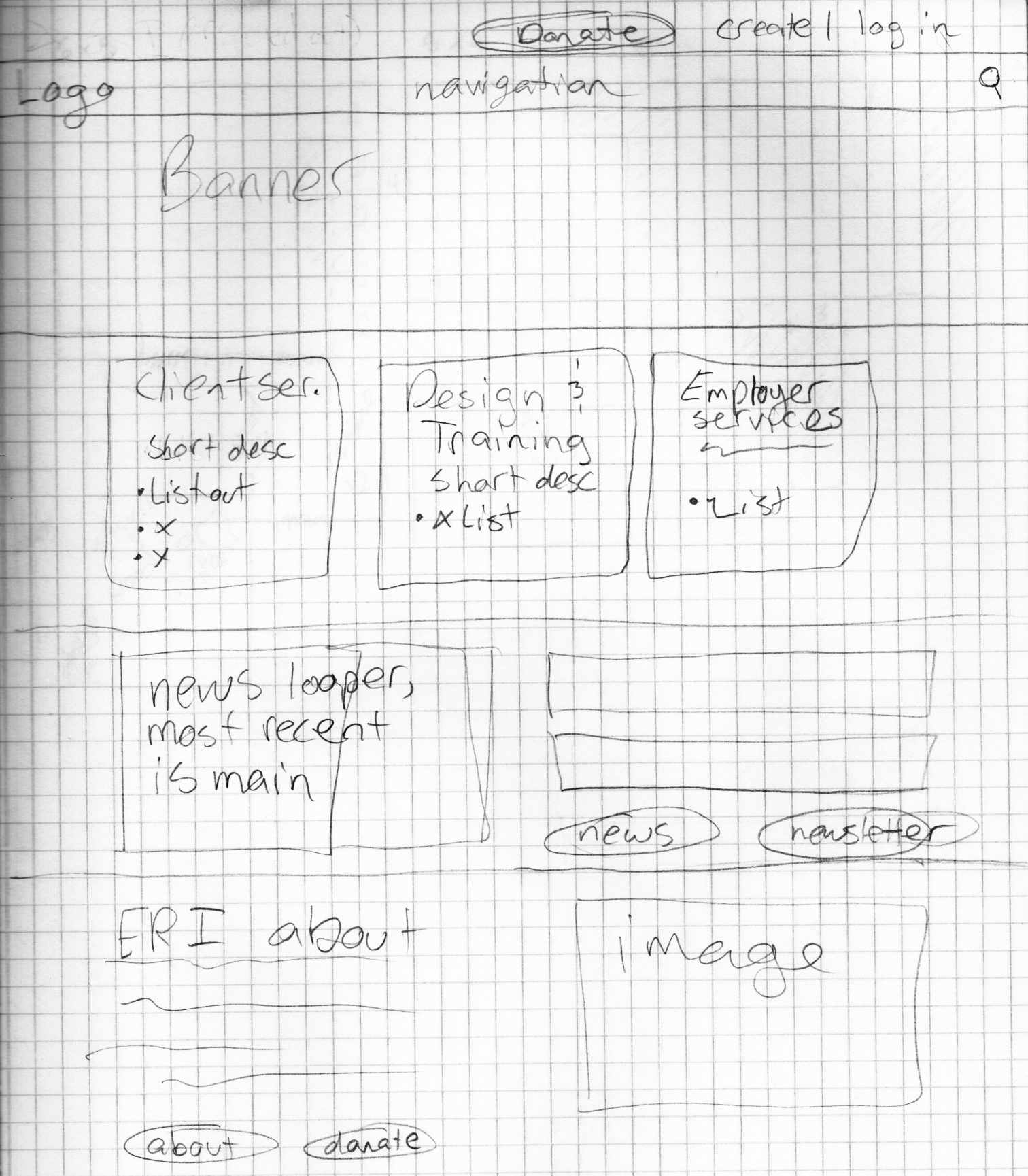
Sketch
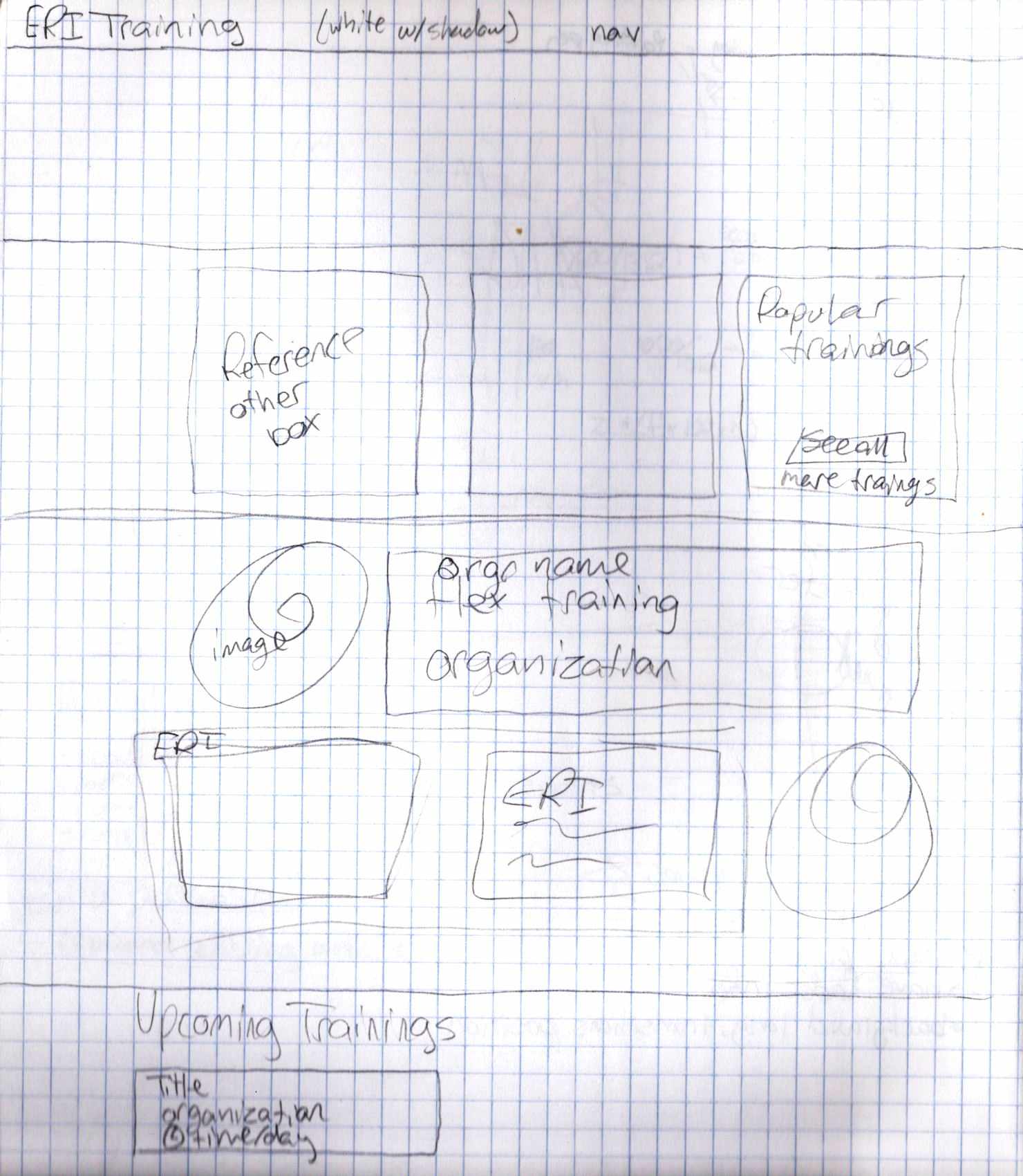
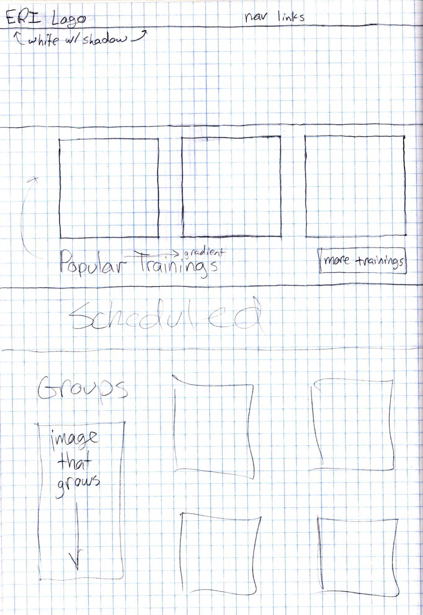
Training Site
While the majority of trainings are managed and hosted by our clients, in this case it was necessary for us to host.
The importance of this project offered the perfect opportunity to revamp our training setup, and online presence, creating a more branded experience.
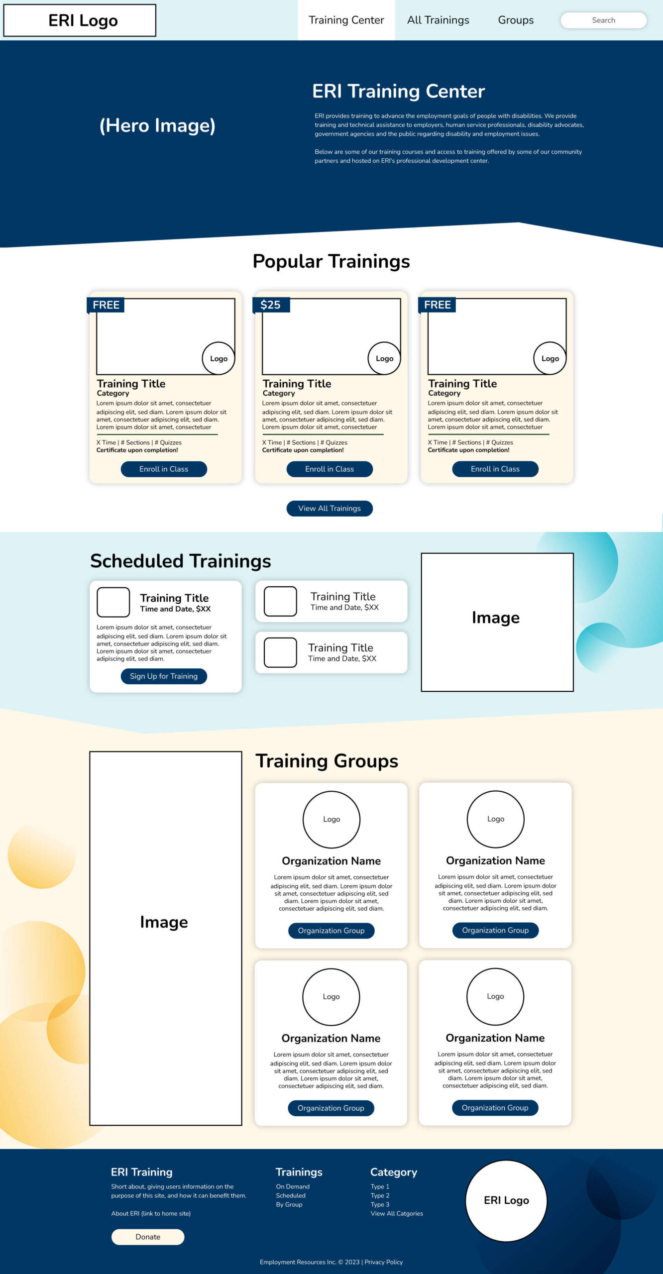
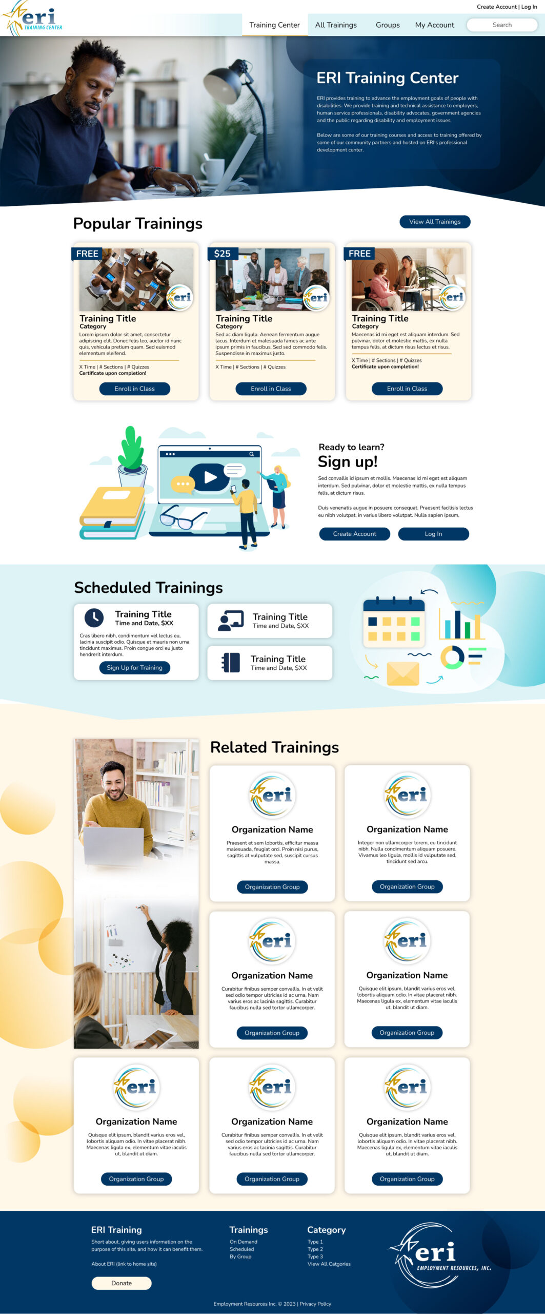
Lo-Fi Mockups
Target Audience
Blog Banners
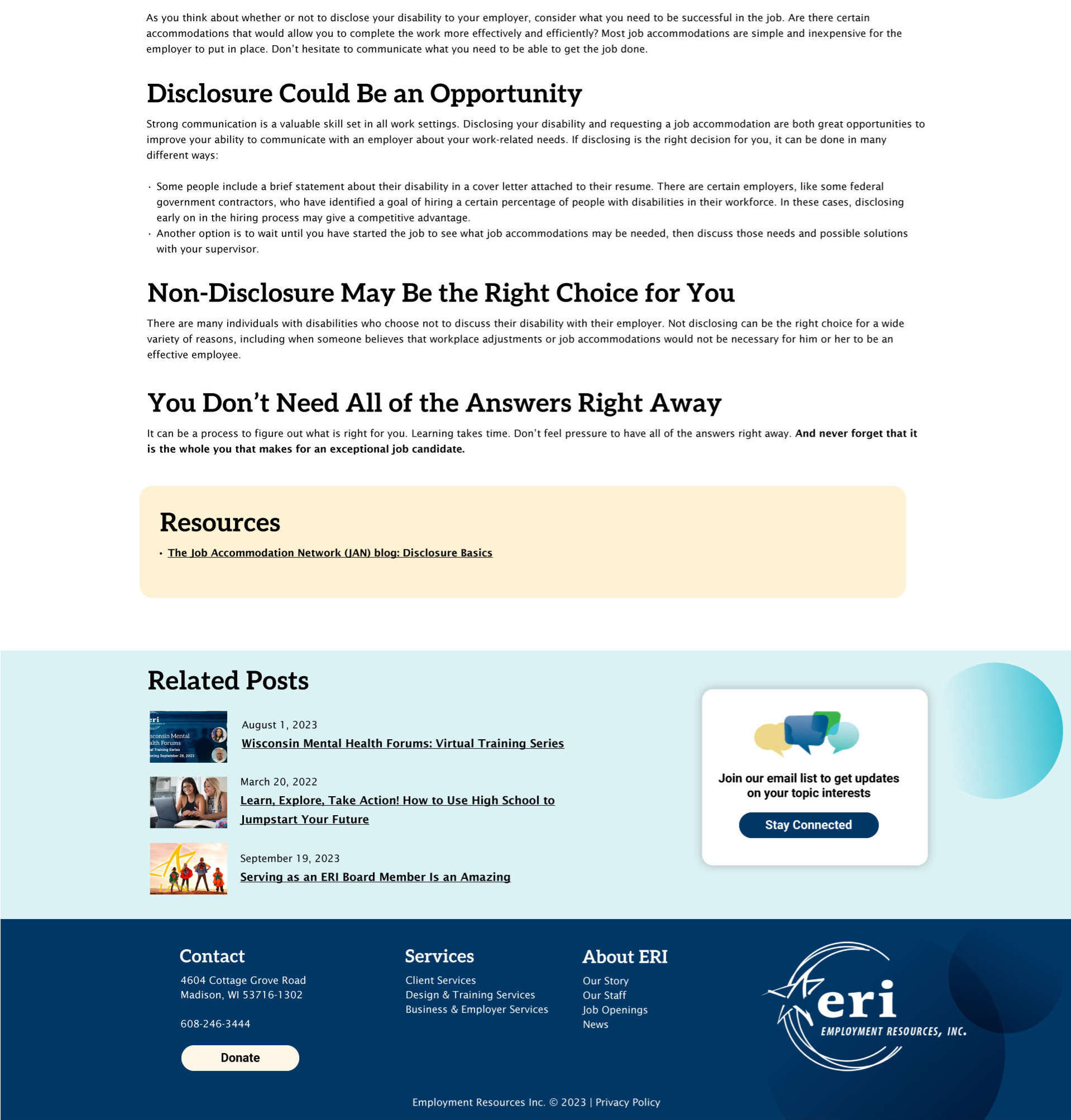
The Wrap-Up
I wrapped up this project with not only a brand new site, but a plan. Templates were created for our teams content creators to hop in and build out pages while maintaining responsiveness and brand cohesion, but I would take it a step further.
By crafting templates, using CSS variables, and working with our backend developer I could set up a staging site that would cut down on creating elements from scratch and update content, like the Privacy Policy, to match the client.