PRIME
Winter to Spring of 2025PRIME (Promoting Retention in Meaningful Employment) is a five-year project focused on helping people with disabilities to stay employed and build meaningful, lasting careers as emphasized in the Workforce Innovation and Opportunity Act.
Funded by the U.S. Department of Education, PRIME works with state vocational rehabilitation agencies to close the gap in long-term job success.
ERI's role in this project was website design and development. Seeing as there were no brand in place before starting the project and some uncertainty around what would work best there were a number of pivots throughout the process
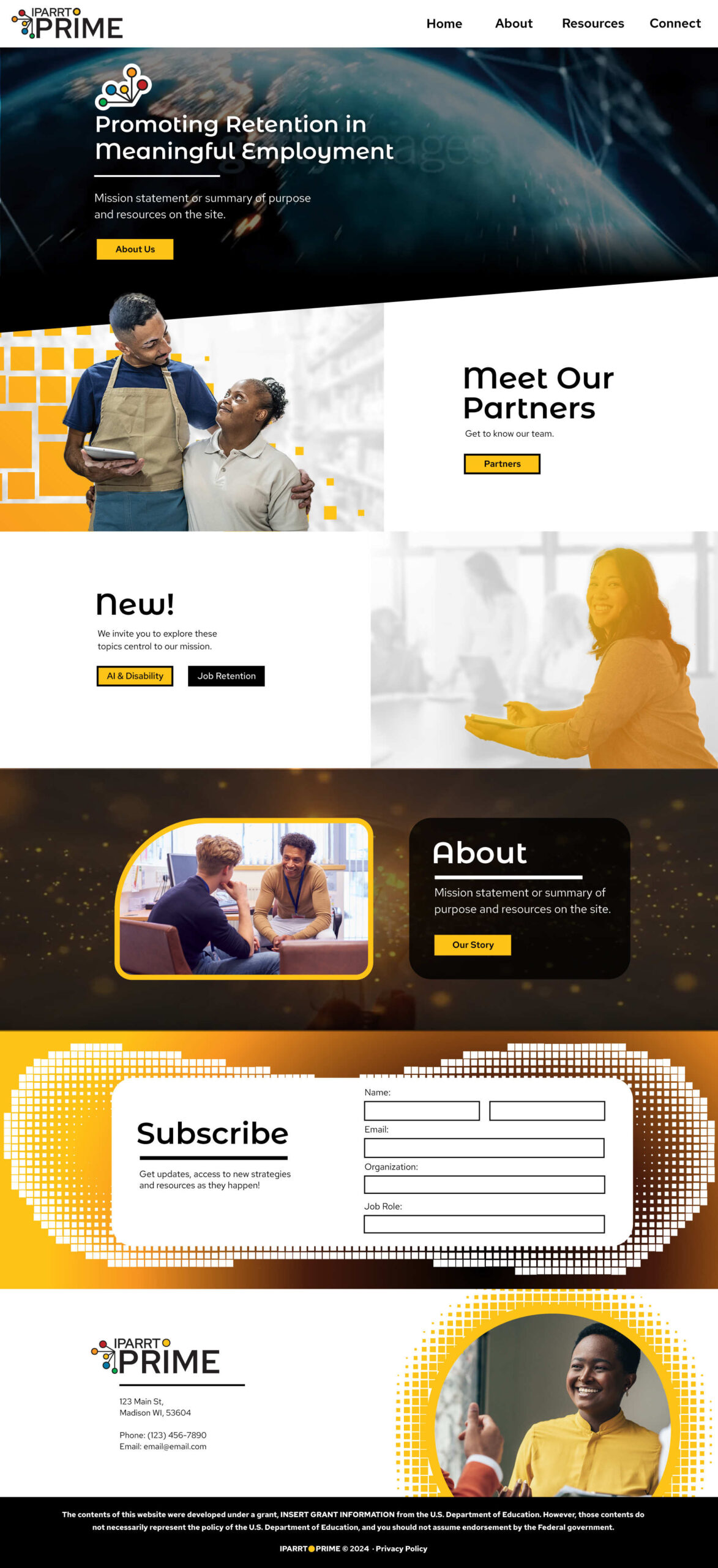
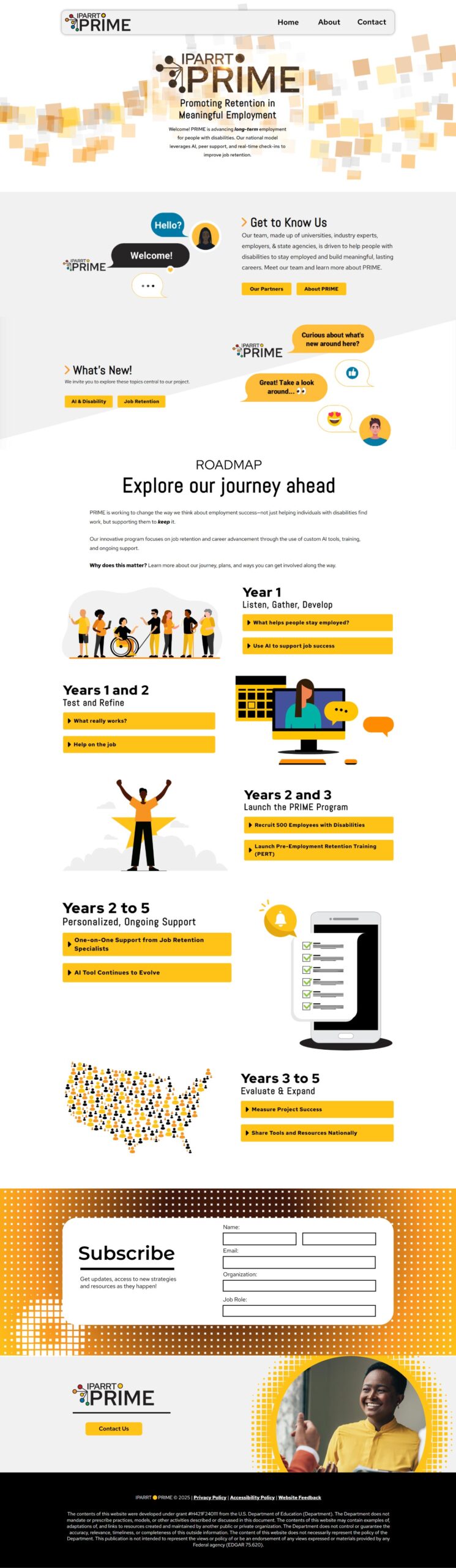
Final Draft
Animated Graphics
I initially created the chat animations in Adobe Animate, but wasn't a fan of that program. For the Roadmap graphics I created them in After Effects, by importing them as Illustrator files, grouping vectors together, adding animation, and using the BodyMovin plugin to export them.
This being my first time using Adobe Animate and After Effects, while there's certainly room for growth, the final animations were clear and clean.
My Process
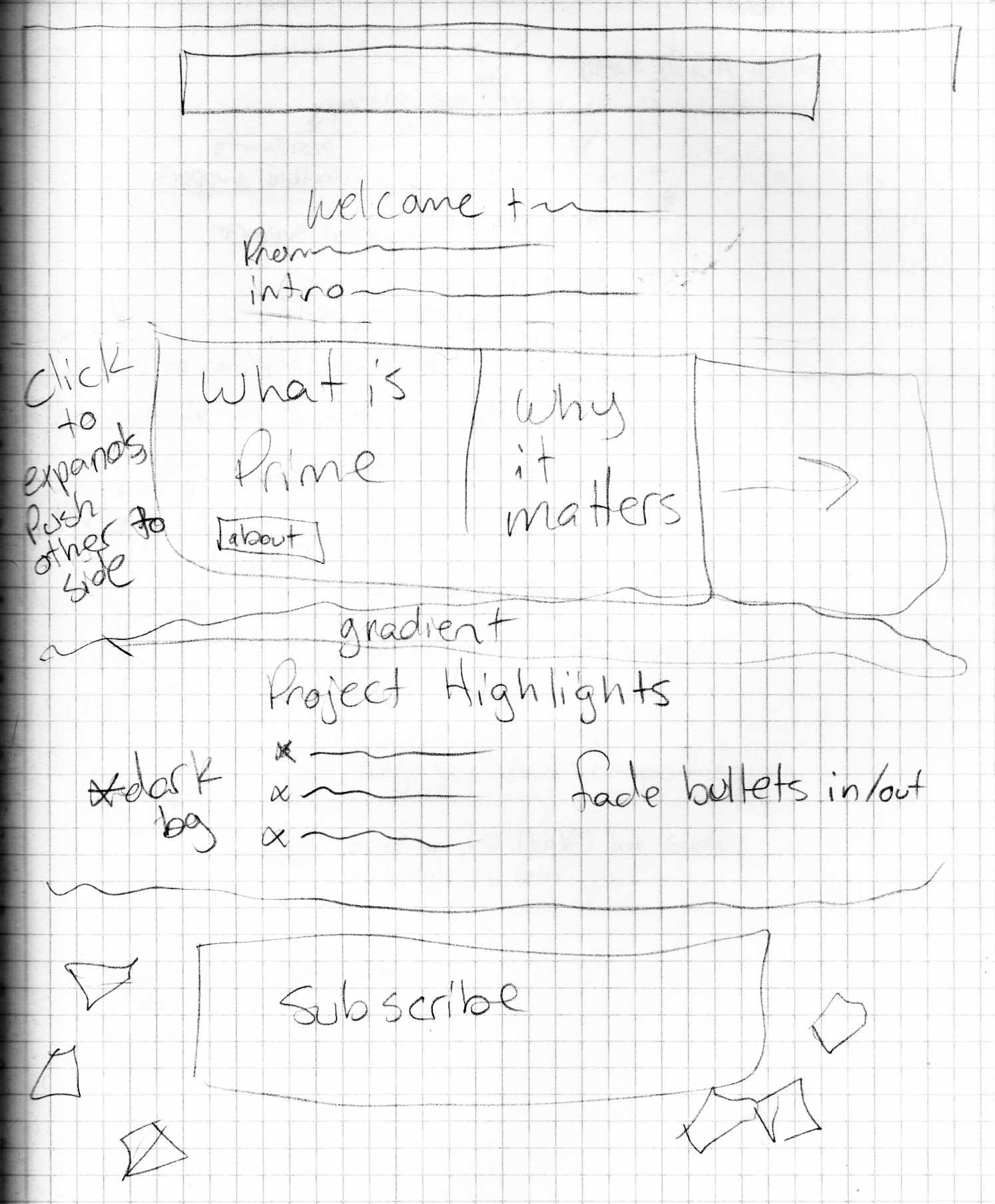
Sketch
Given that the project was in the early stages drafting a simple layout, prioritizing certain content, was a short task.
I initially tackled this project without a sketch, as the layout was consistent with other projects, I drafted the sketch to keep in mind the specific animation and horizontal scrolling requests for development. While this was eventually scratched from the 2nd draft it gives additional insight into the level of flexibility this project needed.
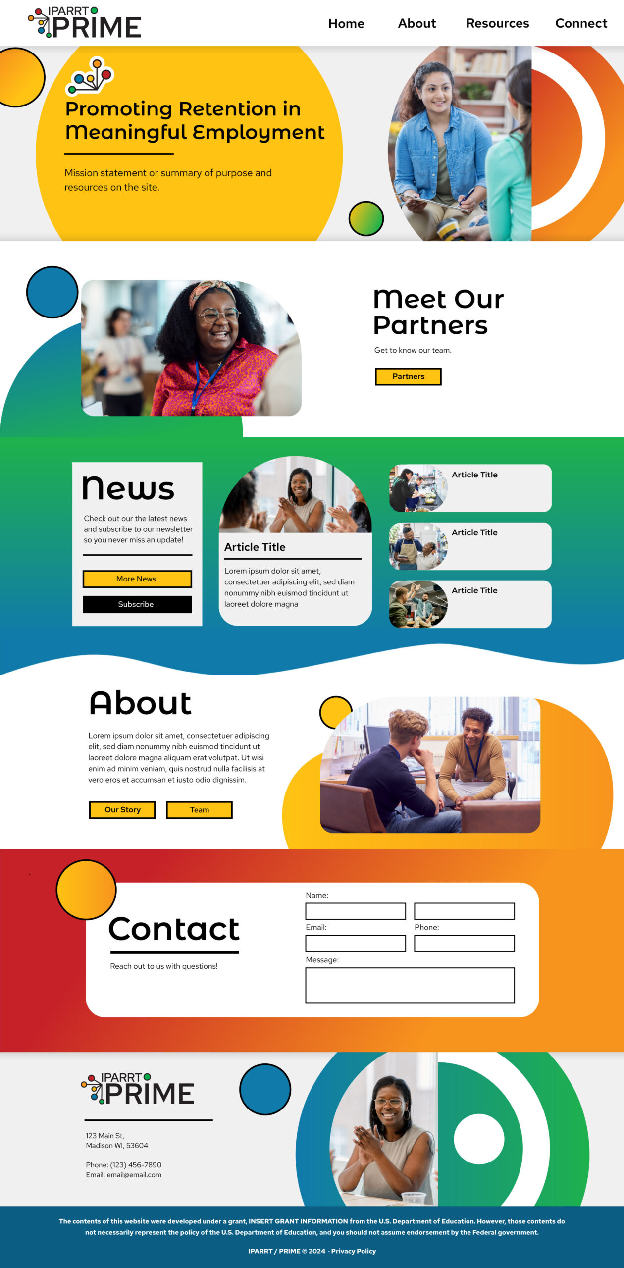
First Draft
There was very little info on the project at the start, I had literally just a logo to go off of and was given the direction of making the design feel modern and pop. At the time I decided to just have fun with it, give them something to give feedback on that, in my opinion, did feel modern, popped, and matched their logo.
In hindsight, this is not my favorite design, would probably look alright with a day care or children's event.
Second Draft
Animations of Note
- On the mockup to the right the banner image was a video of globe with network encompassing it.
- You may with the people squares (large pixels) behind people, the intent being that people would start out as the gradient orange and on scroll their true color would swap out with the gradient and the background "pixels" would slide in.
- The "About" section has a video that's timeline is matched with the users y-scroll.
- The "Subscribe" section had the goal of bringing in white squares as a users cursor passed through it, but that was modified further into the project.